With a passion for puzzles and an appetite for insights, LivelyGreen analysed the competitive landscape, both online and in-store. We delved deep into competitor analysis, researching to understand the F&B landscape. Using these insights, we crafted a branding concept centred around powerful storytelling.
Leveraging multifaceted approaches, we first embarked on extensive sketching and brainstorming, sparking a spectrum of ideas for client consideration. Mood boards then helped hone these concepts and solidify the desired brand aesthetic. Lastly, we thoroughly analysed competitor logos to identify clear differentiators for Terra Organics.
Guided by the keywords “health,” “vegan,” “nature,” and “premium,” we presented two initial concepts: “Goodness of Earth” and “Perfect Quality for All of Us.” The client was drawn to ‘Goodness of Earth,’ which resonated deeply with their core values.
Throughout the project, we ensured all design decisions aligned with the client’s objectives, target audience, and market competition. This thoughtful process refined the logo, resulting in a final design that exceeded their expectations.
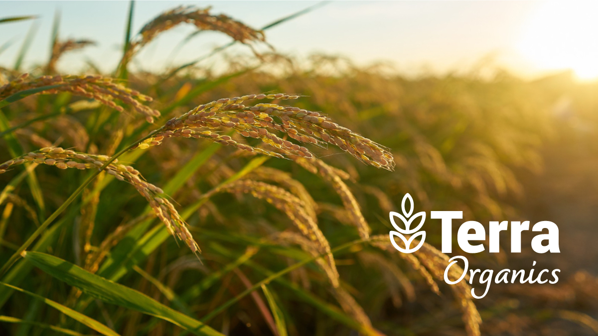
The logo design embodies both premium quality and modernity, achieved through a clean, bold sans-serif font for ‘Terra’ and a script font for ‘organics’ that adds a touch of warmth and personal connection. This distinction fosters brand differentiation.